
Ombre in interiors is a contemporary approach built on gradual colour transitions—either from deep to light tones or from one hue to a neighbouring shade. Often called a “gradient” or “dégradé,” this effect can be woven into many elements of a room’s design. Used thoughtfully, it adds depth, softness, and movement without resorting to busy patterns. Below, we’ve gathered practical ideas for where—and how—to apply ombre in an apartment or office so the look feels intentional, not experimental.
Why it works: a controlled fade guides the eye, subtly reshaping how we perceive proportion and scale. Horizontal gradients can visually widen a wall; vertical gradients can make ceilings feel higher. Because ombre relies on value shifts rather than loud contrast, it plays well with minimal, classic, or even bold schemes and is easy to update over time.
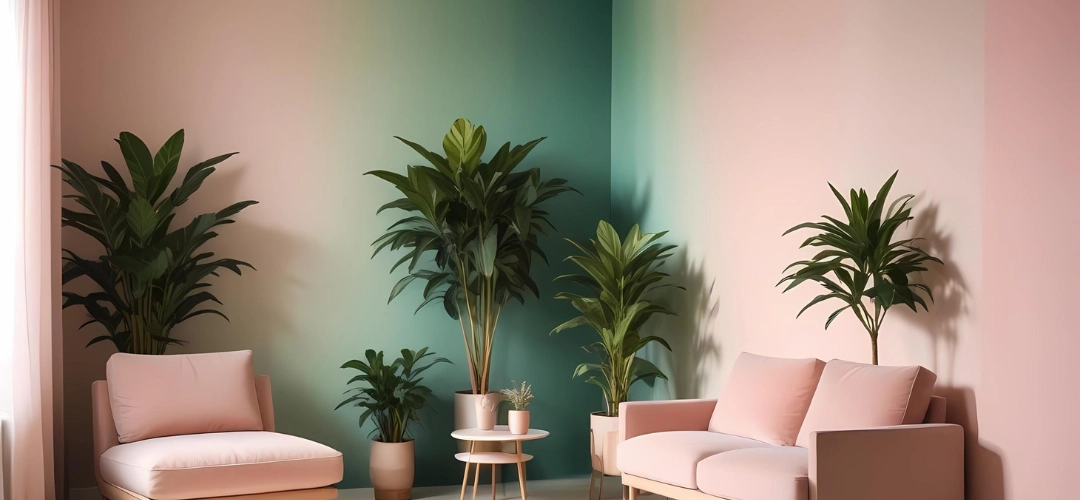
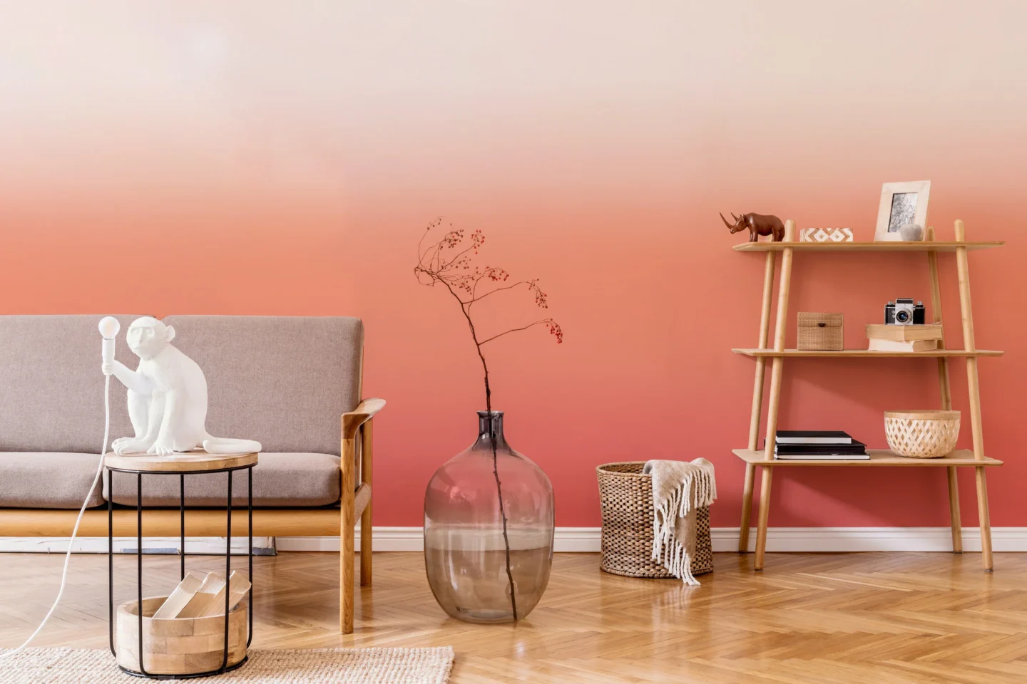
Ombre in the decoration of the walls
The wall is where ombre speaks loudest. You can use the effect in any room; the key is selecting tones that suit the function and natural light. Executing a large, seamless gradient takes care and experience—an even hand with a sprayer or short, controlled strokes with a roller/brush to avoid streaks. On smaller wall sections (niches, headboard zones, fireplace returns), a DIY approach is absolutely doable and the payoff can be stunning.
One guiding rule for standard and low ceilings: keep darker shades toward the floor and transition lighter as you move upward—this visually heightens the space. If your ceiling tops 3.5 metres, you have more freedom: try top-to-bottom, bottom-to-top, or even side-to-side fades to sculpt the room’s proportions. For the most restful effect, choose analogous hues (e.g., mist → sky → deep blue) or a single colour moving through three values.
Practical tips: test blends on a primed sample under daylight and warm evening light; stick to matte/eggshell so the fade reads softly; maintain a wet edge between bands and “feather” joins with a clean, dry roller. In high-traffic zones, seal with a low-sheen clear coat to make cleaning easier without adding glare. If you prefer an art-led approach, a large gradient canvas can create the same visual lift with zero mess and instant flexibility.
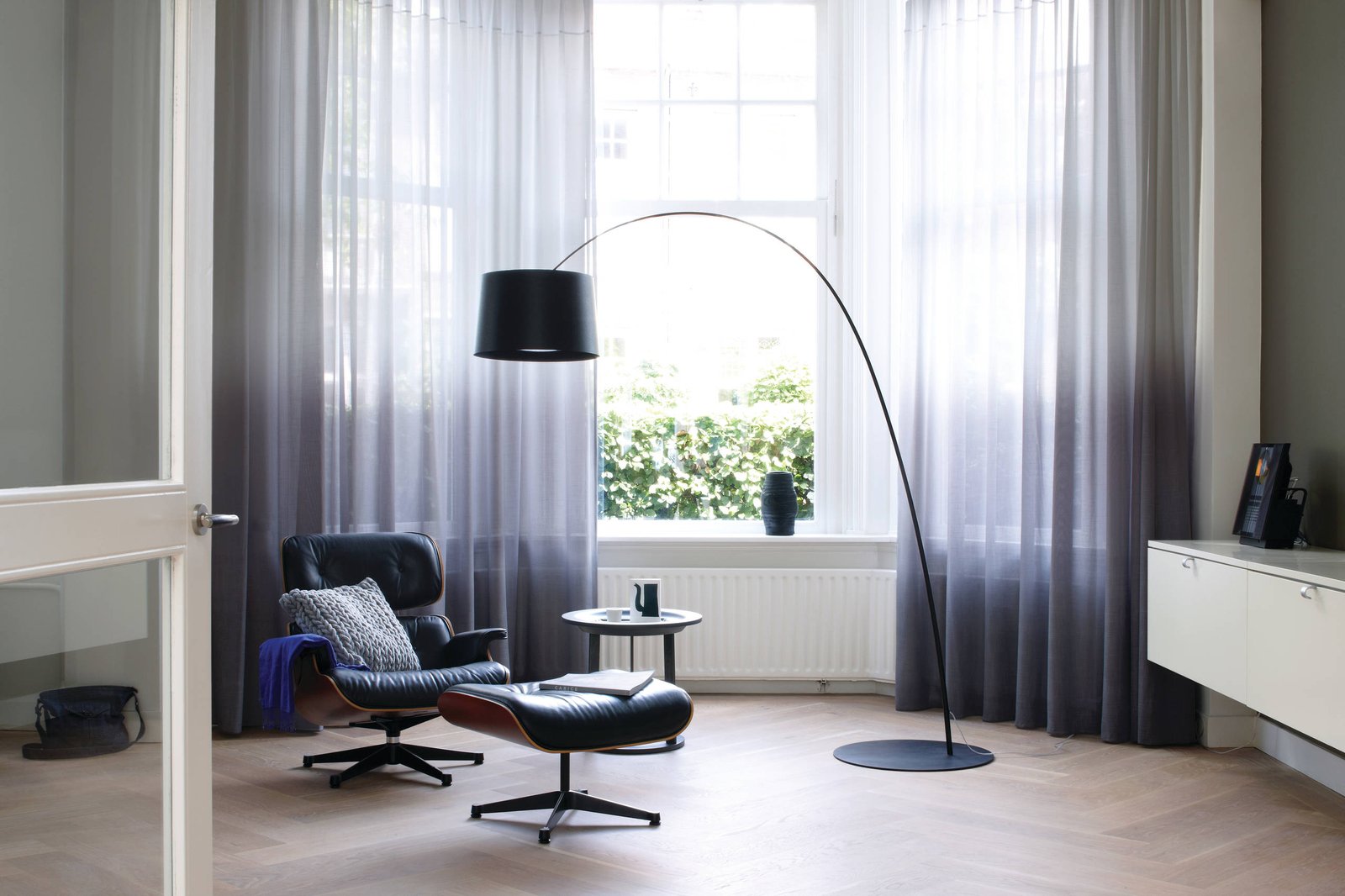
Ombre in the decoration of windows
Textile makers have embraced gradients, so finding ombre fabrics in the right palette is straightforward. Light, airy materials—linen, cotton voile, silk blends, organza—let the fade read softly and keep windows bright. A darker hem that lightens toward the header grounds the view; a pale hem deepening upward frames the glass with a gentle vignette. Soft, watercolour-style prints mimic hand-dyed washes and add an artisanal note without visual noise.
Consider how the gradient interacts with outside light: south-facing rooms tolerate stronger shifts, while dimmer rooms benefit from subtle tonal steps. Lining matters too—choose a lightweight or dim-out lining that preserves drape and prevents the gradient from looking dull in backlight. Coordinate curtain fades with wall or rug tones so the palette feels cohesive rather than themed.
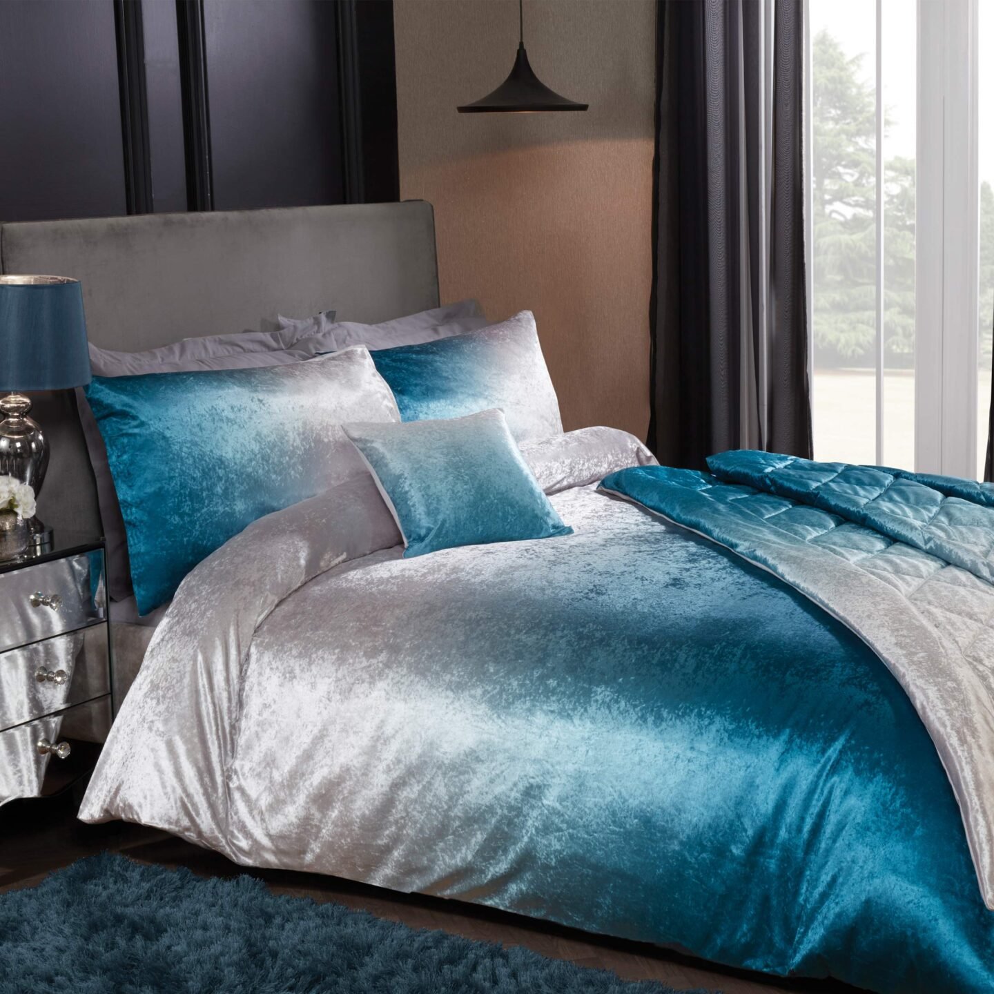
Bed linen with an ombre effect
Because bedding covers a large visual field, an ombre duvet or quilt can set the entire mood of a bedroom. The challenge is quality: look for well-dyed textiles with smooth tonal steps so the gradient remains crisp after washing. Monochrome fades (charcoal → silver) feel hotel calm; coastal palettes (sand → shell → sea) read relaxed and airy. Keep sheets solid and echo one gradient tone in cushions or a throw to avoid clutter.
Care and comfort count: prefer breathable fibres (cotton percale, sateen, linen) with colourfast dyes; wash on gentle cycles and dry out of direct sun to preserve the transition. If you like seasonal changes, rotate a deeper winter gradient with a lighter summer one while keeping the same neutral sheets—fast refresh, minimal spend.
Ombre furniture
Furniture is another clear canvas for the effect—especially framed pieces with doors or drawers (dressers, sideboards, cabinets). You don’t need to hunt for ready-made colourways: sand, prime, and paint your own gradient. Start with one base hue plus white; mix several tints to step from deep at the bottom to pale at the top (or vice versa). Consistent spacing between shades and unified hardware keep the result looking custom, not crafty. For a softer touch, upholster a bench or headboard in ombre fabric that fades vertically to add height.
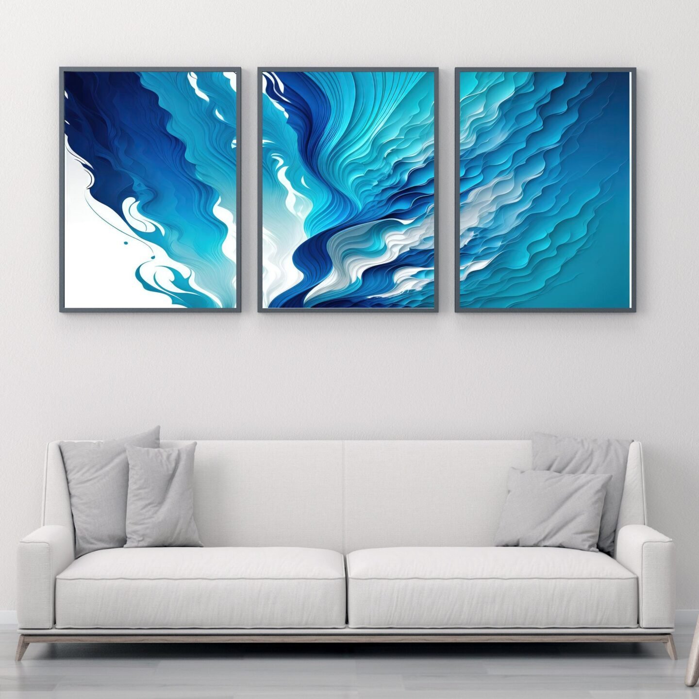
If you’d rather introduce the look through art instead of paint, a single large ombre artwork delivers the same serene transition with zero mess. For scale-specific, ready-to-hang pieces that match your wall width and palette, explore curated options at https://tryartwork.com—a confident, oversized gradient can anchor a seating area or headboard wall in minutes, guiding the placement of lamps, side tables, and accent chairs while keeping the room calm and cohesive.
Finally, remember proportion: limit a room to one “hero” gradient (wall, window, bedding, or furniture) and let the rest of the palette support it. That restraint keeps the ombre effect sophisticated, ensuring the space feels intentional, balanced, and quietly dynamic.